Color is not decoration in logo design. It is communication at a psychological level. Before a customer reads a business name or understands a service, they already form an impression based on color alone. That first impression can decide whether they trust a brand, ignore it, or remember it.
In competitive markets where attention spans are short and alternatives are endless, brand color choices often carry more influence than typography or even the icon itself. Every shade communicates emotion, intent, and personality. Understanding that language is essential for building a logo that performs in real business environments, not just looks good on paper.
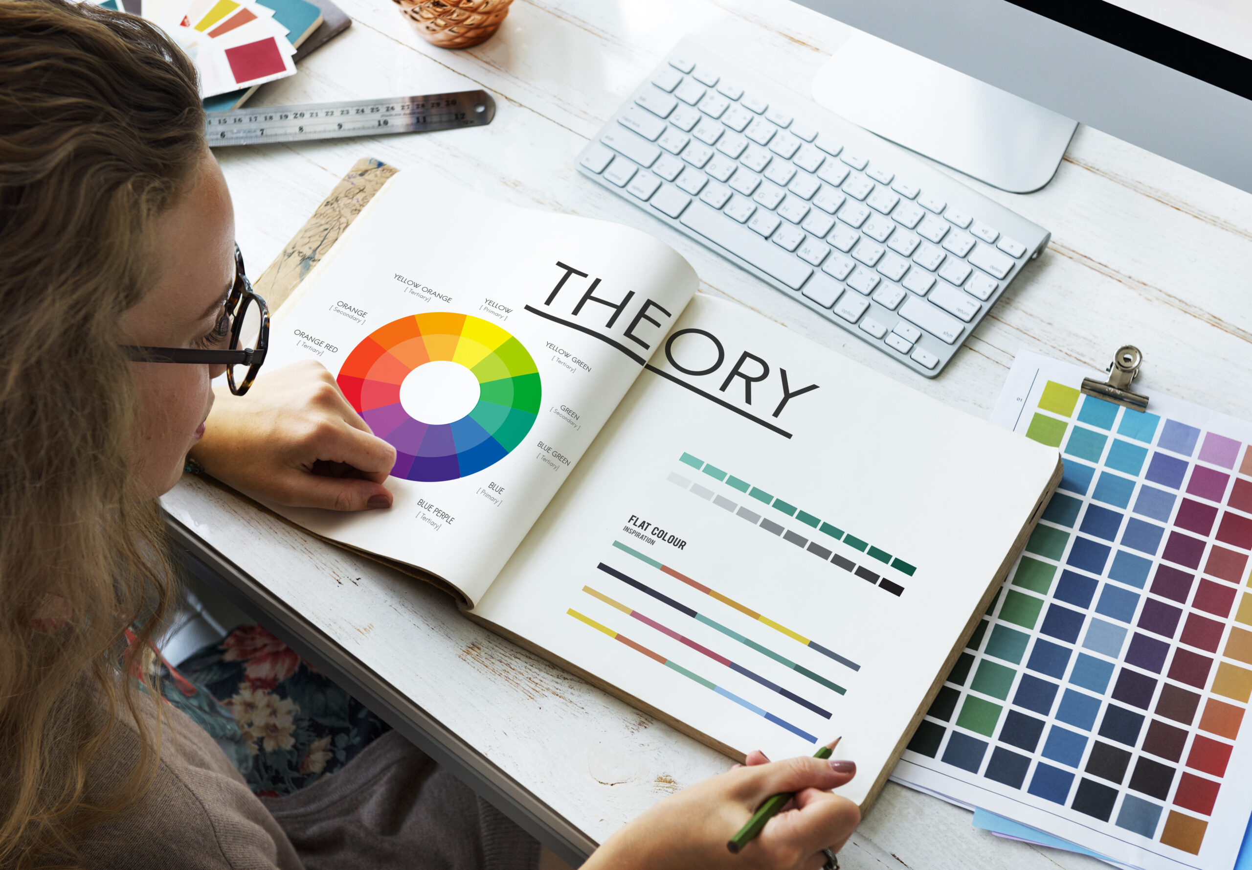
Why Brand Colors Matter in Logo Design
Brand colors influence perception faster than words. Studies in consumer psychology consistently show that people make subconscious judgments about products within seconds of visual exposure. Those judgments are heavily shaped by color associations stored in memory.
A strong logo color strategy does three things:
It establishes emotional positioning, such as trust, excitement, or luxury
It improves brand recall across digital and physical platforms
It differentiates a brand from competitors in crowded industries
This is why global brands protect their color palettes with the same seriousness as their trademarks.
Red: Energy, Urgency, and Power
Red is one of the most emotionally charged colors in branding. It represents energy, urgency, passion, and strong physical reaction. It is often used when brands want to stimulate action or create intensity.
Common associations:
- Excitement and speed
- Appetite stimulation
- Confidence and boldness
- Emotional intensity
Industries that frequently use red include food chains, entertainment platforms, and fast-moving consumer brands. However, red must be handled carefully. Too much of it can feel aggressive or overwhelming if not balanced with neutral tones.
Blue: Trust, Stability, and Professionalism
Blue is one of the most widely used brand colors in corporate identity systems. It signals reliability and structure, which is why it dominates finance, technology, and healthcare branding.
Common associations:
- Trust and credibility
- Security and intelligence
- Calmness and control
- Professional communication
Blue works particularly well for businesses that need to reduce perceived risk. It creates a psychological sense of stability, which is essential for customer confidence in services involving money, data, or long-term commitments.
Yellow: Optimism, Attention, and Warmth
Yellow is associated with positivity and visibility. It grabs attention quickly and is often used as an accent color rather than a dominant base because of its intensity.
Common associations:
- Happiness and optimism
- Clarity and friendliness
- Attention and alertness
- Youthful energy
Brands that use yellow effectively tend to focus on approachability and high visibility. However, excessive yellow can become visually tiring, so it is usually paired with darker contrast tones.
Green: Growth, Health, and Balance
Green is strongly linked to nature and wellbeing. It is also connected to financial prosperity in many cultures, making it a versatile color for multiple industries.
Common associations:
- Growth and renewal
- Health and wellness
- Financial success
- Harmony and balance
Green works especially well for environmental brands, organic products, wellness services, and financial institutions that want to signal stability and growth.
Black: Luxury, Authority, and Sophistication
Black is one of the most powerful colors in premium branding. It communicates authority and exclusivity when used correctly.
Common associations:
- Luxury and elegance
- Power and control
- Minimalism and sophistication
- Formality and exclusivity
Black is often used in high end fashion, automotive branding, and luxury services. It allows other design elements, especially typography and spacing, to stand out with clarity.
White: Simplicity, Clean Design, and Clarity
White represents minimalism and space. In logo design, it is rarely used alone but plays a critical role in balance and contrast.
Common associations:
- Clean and modern design
- Simplicity and clarity
- Honesty and transparency
- Open space and neutrality
White is essential in modern branding systems because it improves readability and helps other colors breathe visually. It is often the foundation of minimalist brand identities.
Purple: Creativity, Luxury, and Imagination
Purple carries a sense of uniqueness and imagination. Historically linked to royalty, it still retains a premium and creative identity in modern branding.
Common associations:
- Creativity and imagination
- Luxury and exclusivity
- Spiritual depth
- Innovation and originality
Purple works well for beauty brands, creative industries, education platforms, and luxury services that want to stand out with a distinctive identity.
Orange: Confidence, Energy, and Approachability
Orange blends the urgency of red with the warmth of yellow. It is friendly, energetic, and highly engaging.
Common associations:
- Enthusiasm and motivation
- Friendly communication
- Creativity and innovation
- Confidence without aggression
Orange is often used by brands that want to feel modern and accessible while still maintaining strong visual energy. It performs well in digital environments where attention is competitive.
Pink: Emotion, Care, and Soft Strength
Pink has evolved beyond traditional associations and is now widely used in modern branding for emotional connection and expressive identity.
Common associations:
- Care and compassion
- Femininity and softness
- Emotional connection
- Modern expressive branding
Contemporary brands often use pink in combination with neutral tones or bold contrasts to create a refined, modern identity rather than a traditional one.
Brown and Earth Tones: Stability and Authenticity
Earth tones communicate groundedness and natural authenticity. They are often used in artisanal, organic, and handcrafted product branding.
Common associations:
- Reliability and stability
- Natural and organic identity
- Warmth and tradition
- Handmade authenticity
These tones help brands feel more human and less corporate, especially in lifestyle and food industries.
How Culture Influences Color Meaning
Color perception is not universal. Cultural interpretation can shift meaning significantly. For example, white is associated with purity in some regions, while in others it is linked to mourning. Red can signal danger in one context and celebration in another.
Brands operating globally must account for these differences when selecting logo colors. A successful identity system is not just visually appealing, it is culturally aware.
Choosing the Right Color Strategy for Your Brand
Selecting a logo color is not about preference. It is a strategic decision based on audience psychology and industry positioning.
A practical approach includes:
Understanding your target audience and their emotional triggers
Analyzing competitors and identifying color gaps in your industry
Defining your brand personality in clear psychological terms
Testing color performance across digital and print environments
A well structured palette usually includes a primary brand color, a secondary supporting tone, and neutral base colors to maintain flexibility.
Common Mistakes in Brand Color Selection
Many brands weaken their identity through avoidable color mistakes.
Some of the most common issues include:
Using too many dominant colors without hierarchy
Ignoring contrast and readability in digital formats
Copying competitor palettes without differentiation
Choosing colors based on personal preference instead of strategy
Failing to test how colors appear across screens and print materials
A strong logo system avoids randomness and relies on consistency and intentional design logic.
How Logo Wizardz Helps Build Strategic Brand Color Systems
A professional logo is not just a graphic, it is a structured identity system. At Logo Wizardz, color strategy is treated as a core part of branding, not an afterthought.
The process focuses on aligning color psychology with business goals, ensuring that each palette communicates the right message to the target audience. Whether a brand needs authority, creativity, luxury, or approachability, color direction is built to support that positioning with precision.
For consultation or branding support, you can reach us directly at (917) 818-3450.
Final Thoughts
Brand colors are not just design choices. They are emotional signals that shape how customers interpret a business in seconds. Understanding the meaning behind each color allows brands to build stronger recognition, clearer messaging, and more consistent identity across platforms.
A well chosen palette can elevate a business from being visually average to instantly recognizable. In a market where attention is limited and competition is constant, that difference is not cosmetic. It is strategic.