
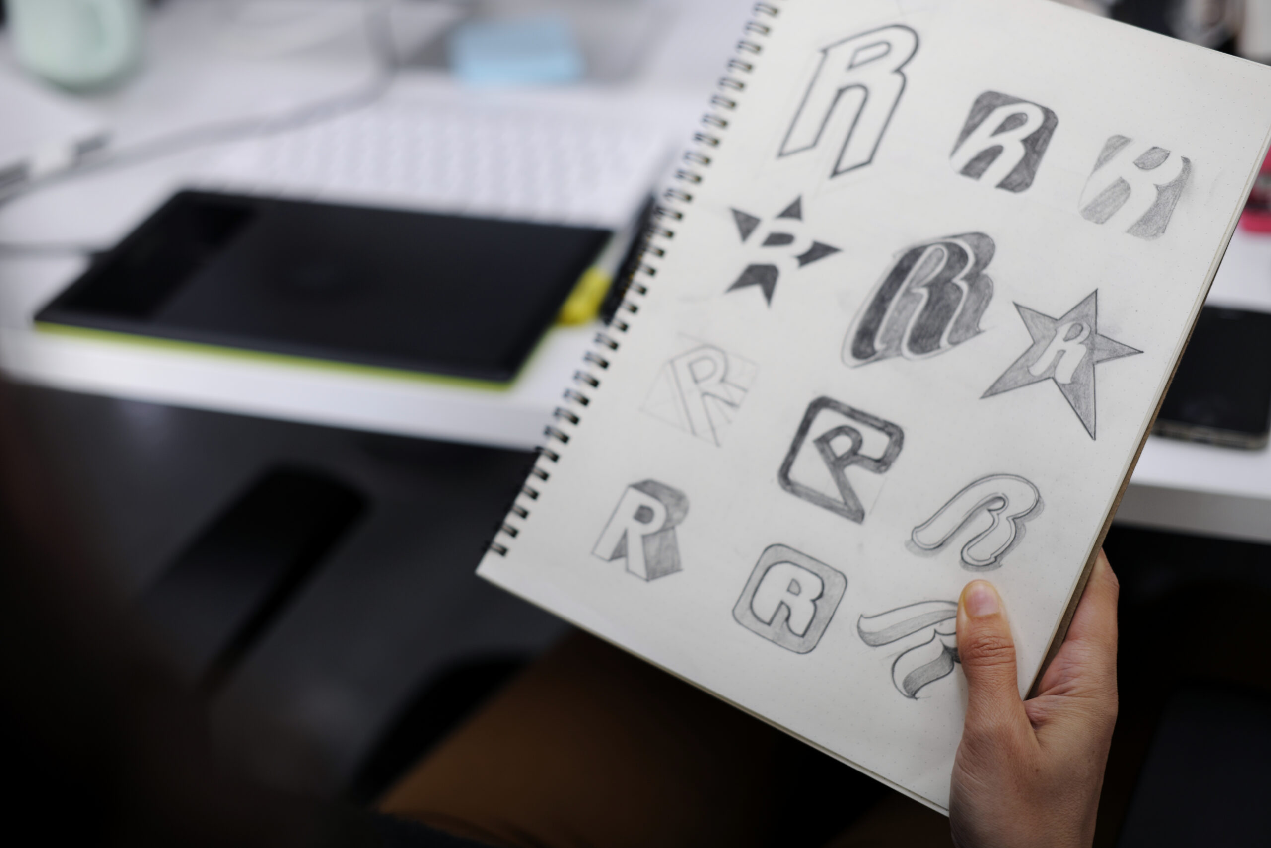
A logo is often the first visual interaction a customer has with a business. Before someone reads a tagline, explores a website, or learns about a company’s products and services, they may already be forming an opinion based on the logo. One of the strongest elements shaping that first impression is color.
Color can communicate personality, influence emotions, establish expectations, and help a brand become recognizable. A carefully selected color palette can make a business appear trustworthy, energetic, sophisticated, creative, approachable, luxurious, or innovative. On the other hand, poorly selected colors can create confusion, communicate the wrong personality, or make an otherwise strong logo feel unprofessional.
For businesses investing in professional branding, understanding how colors influence brand perception is therefore essential. A logo is not simply a graphic placed beside a company name. It is a visual representation of the brand, and color plays a major role in determining how that representation is interpreted.
At Logo Wizardz, professional logo design focuses on creating visual identities that are not only attractive but also strategically aligned with a business’s personality, audience, industry, and long-term goals. Visit www.logowizardz.com to learn more about professional logo design and branding solutions.
Why Color Matters in Logo Design
Human beings process visual information extremely quickly. Colors can create an emotional response before an audience consciously analyzes the other elements of a logo.
Think about how different colors feel:
- Red can feel bold, passionate, energetic, and urgent.
- Blue can communicate trust, stability, professionalism, and reliability.
- Green is frequently associated with nature, growth, health, and sustainability.
- Yellow can suggest optimism, happiness, creativity, and energy.
- Orange can feel friendly, enthusiastic, youthful, and approachable.
- Purple can communicate creativity, imagination, luxury, or sophistication.
- Black can suggest strength, elegance, authority, and modernity.
- White can communicate simplicity, cleanliness, openness, and minimalism.
These associations are not absolute rules. Culture, context, industry, typography, imagery, and personal experiences can all affect how a particular color is perceived. Nevertheless, color psychology provides valuable guidance when developing a visual identity.
The goal is not to choose a color simply because it looks attractive. The goal is to select colors that reinforce the message a brand wants customers to receive.
Red: Energy, Passion, and Confidence
Red is one of the most visually powerful colors available to designers. It attracts attention quickly and can create feelings of excitement, urgency, passion, confidence, and energy.
Brands that want to appear bold and action-oriented may benefit from red in their logo design. It can be particularly effective for industries where excitement, speed, competition, or strong emotions are important.
However, red should be used strategically. Excessive use can feel aggressive or overwhelming. A professional logo designer may balance red with neutral tones, white space, or darker shades to create a more sophisticated visual identity.
For example, a deep burgundy can communicate luxury and maturity differently from a bright scarlet red, even though both belong to the same basic color family.
Blue: Trust, Stability, and Professionalism
Blue is one of the most commonly used colors in corporate branding because it frequently communicates trust, reliability, security, and professionalism.
Financial institutions, technology companies, healthcare organizations, consulting firms, and professional service businesses often use blue because they want customers to feel that the organization is dependable.
Different shades of blue can communicate different personalities. Navy blue can appear established and authoritative, while lighter blues can feel more approachable, modern, and relaxed.
When designing a logo, choosing the correct shade matters just as much as choosing the color itself. A color palette should reflect the specific positioning of the business rather than simply following industry trends.
Green: Growth, Nature, and Wellness
Green has strong associations with nature, renewal, growth, health, and sustainability. It can be an effective choice for businesses operating in environmental, wellness, organic, agricultural, financial, or health-related markets.
Green can also communicate balance and freshness. However, not every green creates the same impression.
A dark forest green can feel established and premium, while a bright lime green can appear energetic and youthful. A muted sage green may communicate calmness and natural simplicity.
The shade, saturation, and combination of colors determine how the audience ultimately interprets the logo.
Yellow: Optimism and Creativity
Yellow is bright, energetic, and attention-grabbing. It is commonly associated with happiness, optimism, friendliness, creativity, and warmth.
Businesses targeting younger audiences or wanting to establish a playful and approachable identity may incorporate yellow into their branding.
The challenge with yellow is readability. Bright yellow can be difficult to see against light backgrounds, particularly when used with thin typography or detailed logo elements. Professional logo design therefore requires consideration of contrast and practical application.
A well-designed logo should remain recognizable across websites, social media profiles, packaging, signage, business cards, advertisements, and printed materials.
Orange: Friendly, Energetic, and Approachable
Orange combines some of the energy associated with red with the optimism of yellow. As a result, it can create a friendly, enthusiastic, and approachable personality.
Orange can work well for brands that want to avoid appearing overly corporate while still communicating confidence and energy.
It can be particularly effective for entertainment companies, creative businesses, food brands, startups, sports-related organizations, and companies targeting active or youthful audiences.
The right shade can make a major difference. Bright orange can feel playful and energetic, while burnt orange can create a warmer, more sophisticated appearance.
Purple: Creativity, Luxury, and Imagination
Purple has historically been associated with royalty and luxury, which gives it a distinctive position in brand identity design.
Today, purple can communicate creativity, imagination, individuality, sophistication, and innovation. It is often a strong choice for creative businesses, beauty brands, personal brands, entertainment companies, and businesses that want to differentiate themselves from conventional competitors.
Lavender and softer purple tones can create a calm, elegant, or feminine impression, while deeper purple can appear luxurious and dramatic.
Purple can also help a brand stand out in industries where competitors primarily rely on blue, black, or red.
Black: Strength and Sophistication
Black is a powerful neutral color that can make a logo feel modern, premium, authoritative, and sophisticated.
Luxury fashion brands, creative agencies, technology companies, automotive businesses, and professional service organizations frequently use black because of its versatility.
One of the major advantages of black is that it can work with virtually any other color. A black-and-gold combination, for example, can create a premium appearance, while black and white can produce a clean, timeless, minimalist identity.
A black logo also performs exceptionally well in situations where one-color reproduction is required.
White: Simplicity and Clarity
White may not immediately appear to be a branding color because it is often used as negative space, but it plays an important role in logo design.
White can communicate cleanliness, simplicity, openness, and modernity. More importantly, white space allows other elements of a logo to breathe.
A professional logo should not necessarily fill every available area with graphics, text, and color. Strategic use of empty space can improve readability and make the central symbol or wordmark more memorable.
White also makes logos highly adaptable. A logo designed with strong negative space can work effectively across digital and physical applications.
Color Combinations Matter
Choosing a single color is only part of the branding process. The relationship between colors can dramatically change how a logo is perceived.
Consider the difference between:
Blue + White: Clean, trustworthy, professional, and modern.
Black + Gold: Premium, luxurious, powerful, and sophisticated.
Green + White: Natural, fresh, healthy, and environmentally conscious.
Red + Black: Bold, dramatic, energetic, and powerful.
Purple + Gold: Creative, luxurious, distinctive, and elegant.
Orange + Blue: Friendly, energetic, balanced, and approachable.
Color combinations should be selected based on the brand strategy rather than personal preference alone.
A business owner may personally love a particular color, but that does not automatically mean it is the right choice for the company’s target market.
Industry Expectations Should Influence Color Selection
Different industries often develop recognizable visual conventions.
Technology businesses commonly use blue, black, purple, or gradients to communicate innovation and modernity. Financial businesses frequently use blue and other conservative colors to reinforce trust. Health and wellness brands often use green, blue, and softer natural colors. Luxury brands may favor black, gold, white, deep purple, or muted tones.
However, following industry conventions too closely can make a business blend in.
This creates an important strategic question:
Should your logo follow industry expectations or challenge them?
The answer depends on the brand.
A financial company may need to communicate stability and trust, but it can still use a distinctive color combination to separate itself from competitors. A technology startup may use purple instead of the traditional corporate blue to appear more creative and innovative.
Effective logo design finds the balance between familiarity and differentiation.
Color and Target Audience
Color preferences can vary based on demographics, culture, geography, age groups, and individual experiences. That means a logo should be designed with the intended audience in mind.
A children’s brand might benefit from bright, energetic colors. A luxury consulting firm may need a restrained, sophisticated palette. A fitness company might use energetic colors to create a sense of movement and motivation.
Understanding the target audience helps determine whether the visual identity should feel:
- Professional or casual
- Traditional or modern
- Luxurious or accessible
- Energetic or calm
- Playful or serious
- Bold or understated
Color is one of the tools that helps communicate these distinctions instantly.
Color Consistency Builds Brand Recognition
Selecting the right colors is only the beginning. Brands also need consistency.
Once a business establishes its primary and secondary colors, those colors should be used consistently across its major marketing materials.
This can include:
- Website design
- Social media profiles
- Business cards
- Product packaging
- Advertising
- Email marketing
- Presentations
- Signage
- Merchandise
- Print materials
- Digital advertisements
Consistent color usage makes it easier for customers to recognize the brand across different environments.
Imagine seeing the same color combination repeatedly on a website, Instagram post, advertisement, product package, and storefront. Even before reading the company name, the visual pattern can begin to trigger recognition.
That is the power of a consistent brand identity.
Logo Design Must Work Without Color Too
An important professional logo design principle is that a logo should not depend entirely on color to communicate its identity.
A strong logo should remain recognizable in black and white or grayscale.
Why?
Because businesses may eventually need to use their logo in situations where color is unavailable or impractical. Examples include invoices, contracts, photocopies, newspaper advertisements, embroidery, engraving, stamps, and certain printing applications.
If a logo only looks good when rendered in a specific color combination, its flexibility may be limited.
This is why professional logo designers consider shape, typography, proportion, spacing, symbolism, and composition alongside color.
Avoid Choosing Colors Based Solely on Trends
Design trends can be useful sources of inspiration, but businesses should be cautious about building their entire visual identity around temporary trends.
A color palette that looks modern today may feel dated several years from now.
Businesses typically need logos that can support long-term brand recognition. That means the color strategy should be strong enough to remain effective even as design trends evolve.
A timeless color palette does not necessarily mean boring. It means the colors support the brand rather than making the brand dependent on a temporary aesthetic.
Accessibility and Color Contrast Matter
Professional logo design also requires practical considerations such as accessibility and contrast.
If two colors are too similar in brightness or saturation, text and graphic elements may become difficult to distinguish. This can create problems across websites, mobile interfaces, advertisements, and printed materials.
Designers should therefore evaluate how colors perform in different environments and at different sizes.
A logo may look excellent on a large desktop monitor but become unclear when reduced to a small social media profile image. Similarly, a color combination that works beautifully on a screen may reproduce differently in print.
Good logo design considers these real-world applications from the beginning.
The Psychology of Color Is Not a Formula
It is important to remember that color psychology is a guide, not a guaranteed formula.
There is no universal rule stating that every blue logo will make customers trust a company or that every red logo will increase sales.
Brand perception is influenced by many factors, including:
- Logo shape
- Typography
- Imagery
- Industry
- Brand messaging
- Customer experience
- Cultural context
- Product quality
- Marketing
- Color combinations
- Consistency
Color works as part of a larger brand identity system.
The most effective logo designers therefore combine design principles with strategic thinking rather than relying on color psychology alone.
How Professional Logo Designers Choose Brand Colors
A professional logo design process typically begins by understanding the business.
Questions may include:
- What does the company do?
- Who is the target audience?
- What makes the business different?
- What emotions should the brand communicate?
- Who are the primary competitors?
- Should the brand appear premium, affordable, innovative, traditional, or approachable?
- Where will the logo be used?
- Does the company have existing brand colors?
- What visual styles should be avoided?
- How should the brand evolve in the future?
The answers help establish a visual direction.
Instead of randomly experimenting with colors, designers can develop palettes that have a strategic purpose.
This approach creates a stronger connection between the logo and the overall business strategy.
Why Professional Logo Design Matters for Your Business
Your logo may appear on almost every customer-facing part of your business. It represents your company when you are not personally present to explain what you do.
A professionally designed logo can help establish credibility, differentiate your business, improve brand recognition, and create a consistent foundation for future marketing.
Color is a major component of that process.
At Logo Wizardz, the goal is to create logos that combine visual appeal with strategic brand communication. Whether you are launching a new company, refreshing an existing identity, or looking for a more professional appearance, thoughtful color selection can make a significant difference.
A strong logo should not simply look good. It should communicate something meaningful about the business.
Final Thoughts: Choose Colors With Purpose
Color can influence how customers perceive a brand before they read a single word. It can communicate energy, trust, luxury, creativity, stability, friendliness, or sophistication.
But successful logo color selection is about more than picking a favorite color.
The strongest brand identities use color intentionally. They consider the target audience, industry, competitors, brand personality, accessibility, applications, and long-term recognition.
Whether you choose bold red, trustworthy blue, natural green, energetic orange, creative purple, sophisticated black, or a carefully balanced combination, the most important question is always:
Does this color help communicate what the brand stands for?
That is where strategic logo design becomes more powerful than decoration.
If you are ready to create a memorable visual identity for your business, Logo Wizardz can help you develop a logo and color strategy designed around your brand’s unique personality and market position. Learn more at www.logowizardz.com or contact Logo Wizardz at 917-818-3450 to discuss your logo design needs.
Your logo is more than a symbol. It is an opportunity to shape perception, establish recognition, and give your business a visual identity that customers remember.

